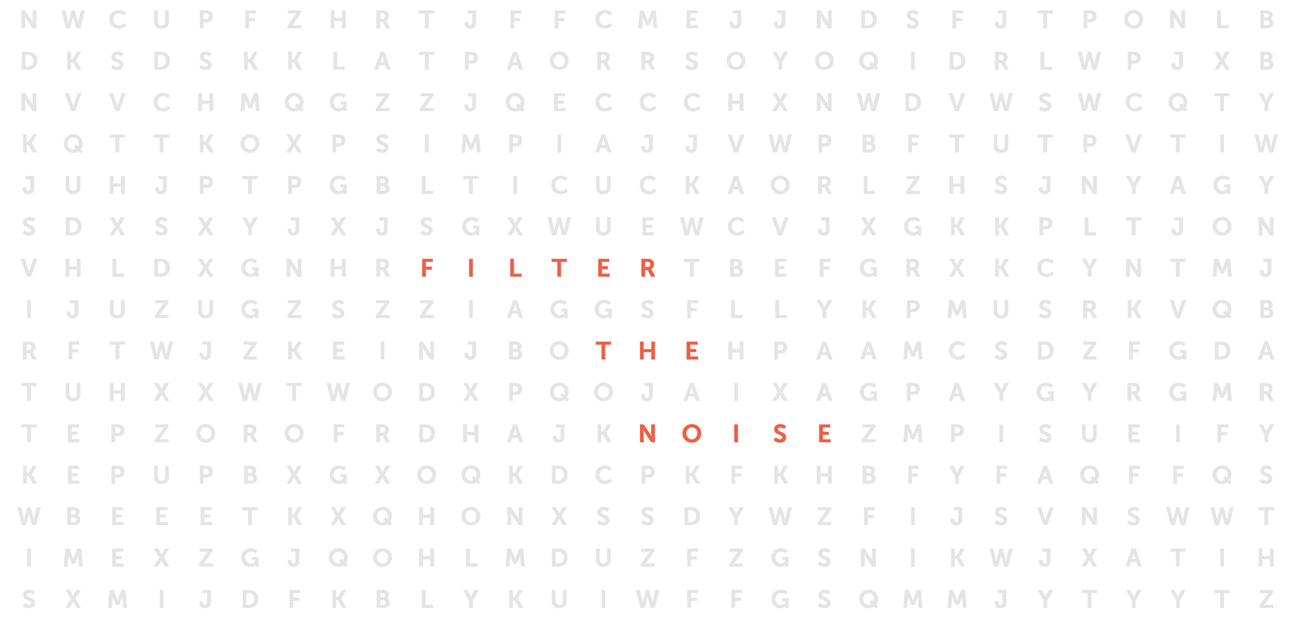
Filtering the Signal from the Noise
InfoNgen
Intelligent Discovery Engine for Business
Role: UX Designer, UX Researcher
Design Team: 4-6 designer (UX+Visual)
Team: Design Team (4+), Product Owner, Customer Relations Manager,
Product Background
Launched in 2004 and powered by EPAM since 2010, InfoNgen is an enterprise-grade intelligent search product. It helps businesses find, share, and analyze critical information among more than 200,000 sources. InfoNgen helps companies filter the signal from the noise in industries like financial services, life sciences, manufacturing, tech, retail, and legal.
35+
Prebuilt Industry-Specific Taxonomies
100+
Satisfied
Customers
30,000+
Government & Regulatory Sources
200,000+
Public Web &
Social Media Sources
How It Works
Imagine you’re a part of a product team and you need to know what consumers are saying about your latest product release. Using InfoNgen smart keywords you can create a personalized newsfeed and get all the feedback from different kinds of websites and social media. And you’ll be always notified about crucial happenings. Moreover, the product allows you to track if you’re getting positive or negative feedback, so it’s an additional opportunity to protect your brand’s reputation by detecting crises before they escalate.
InfoNgen can be applied to many other various uses:
Identify market opportunities and industry trends by learning what your competitors are doing. Find, analyze and share information critical to staying competitive
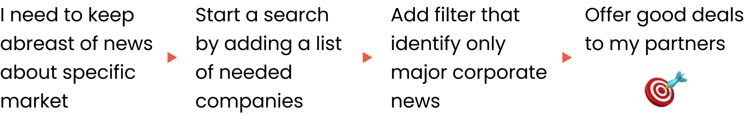
Monitor the latest data and news about your customers and partners to offer them relevant deals and create better business relationships
Keep track of emerging regulations and reduce the cost of compliance issues by discovering violations as soon as possible
The Challenge
Through the 10-year life of the legacy product, its architecture became more and more unfit for modern needs. Scalability became a problem; there were a lot of inconsistencies with the terminology, functionality, and user interface.

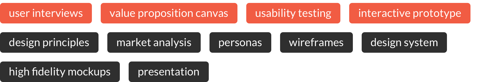
Discovery & Research
We started our work from running an online workshop with the management team and product tech leads to get acquainted with business goals as well as technical capabilities and challenges at a given moment. Our goal was to make a scalable product with an interface that’s holistic, clear, and consistent, yet reflects the system abilities.
To set a high-level vision of the desired outcome we went through creating Value Proposition Canvas. As a result, we make personas, which basically reflect users of two major product versions.
Adam
Newsletter Manager
Level: Advanced

Run in-depth search and analyze information based on predefined criteria
Create personalized newsfeeds and newsletters for others
Able to track sentiment of an article
Kate
Sales Manager
Level: Basic

Read tailored newsfeeds created by organization librarian or admin
Perform simple searches and subscribe to newsletters
From the very beginning, we closely collaborated with the core product team. They possess an extensive amount of information not only about the customer base, but also advanced product features, technical limitations, and future capabilities.
We also made assessments with the existing customers to get a sense of the most typical challenges and ensure that we would not lose the things that work well in the current version.
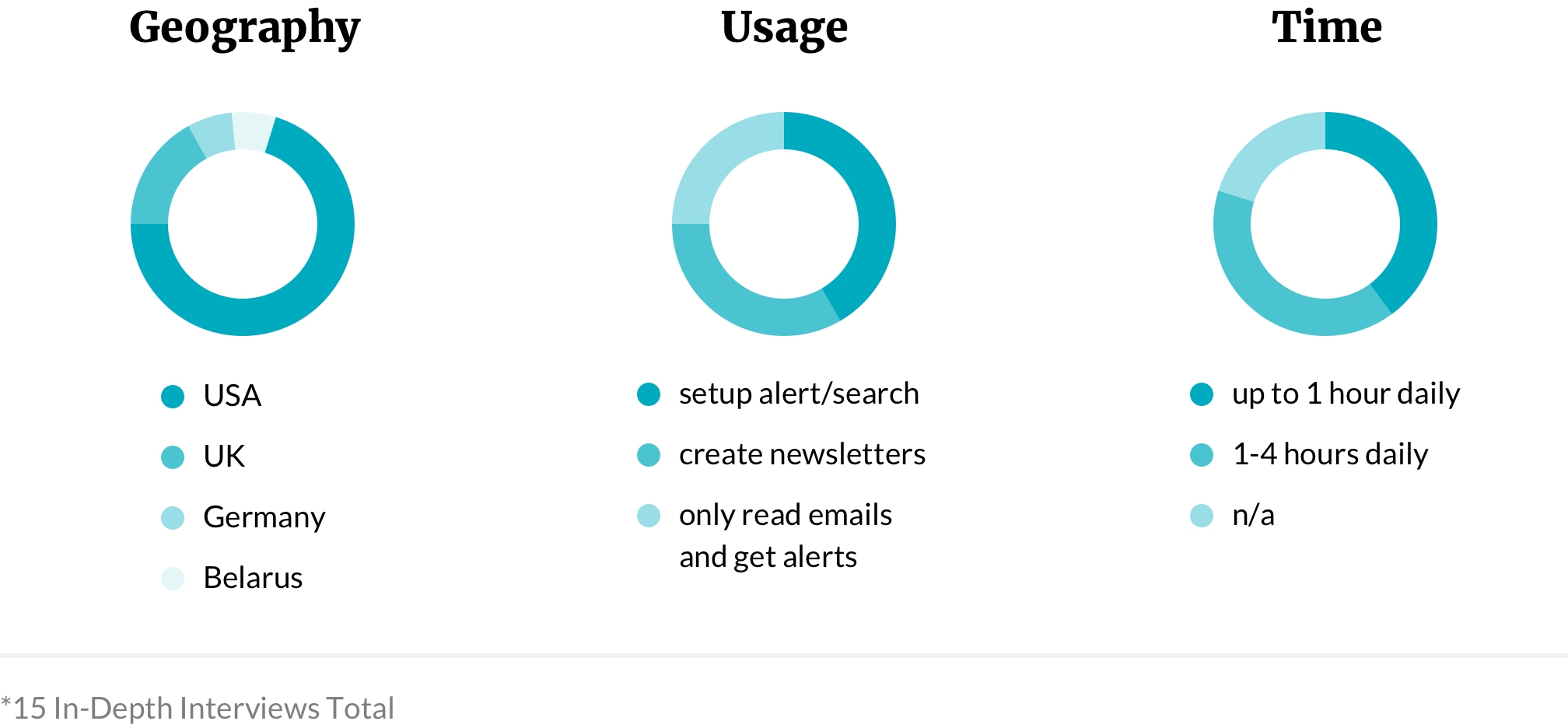
The results gave us many crucial insights to keep in mind, such as:
The product is too complicated at first glance, but gets very useful once people figure out how it works
A lot of practical and convenient features are not utilized simply because users are not acquainted with them
As a result, a vast majority of our audience is having troubles leveraging key functionalities of the product and delegates it to expert users or customer service.

Ideation
We came up with a set of principles that kept us aligned during the whole process. They help guide the team and clients towards making appropriate decisions while making them less subjective.
Knowledge gathered during the discovery and research phases allowed us to focus on crucial challenges and functions at first. And since the product is suitable for lots of different objectives, we prioritized the most important market segments for the initial release.
Merging two portals into one with different levels of access made the system consistent, so users can quickly upgrade from one role to another. In addition, we gave some of the advanced features to a regular user and it leads to a stronger engagement with a product. We have simplified system usability and made it more user-friendly using patterns from familiar applications.
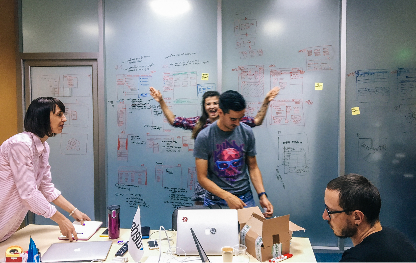
Prototyping
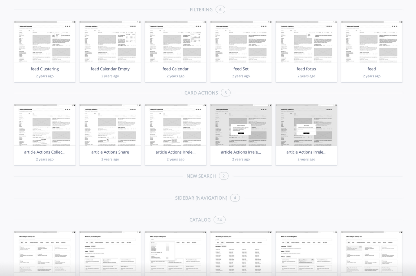
When the basic functions were prototyped, we got aligned with engineers and preliminarily evaluate our wireframes. Meanwhile, visual designers worked on setting a new look of the product. Let's take a look at the main features.
Newsfeed consists only of relevant articles and can be easily modified by some recent requests or variable needs. Displaying primary tags on the article preview helps catch up with a subject immediately. Different view options for the feed help consumers go through the information in the most convenient way. Also people are able to manage their notifications directly from here. Fluent transition between read and edit mode keep the user’s focus on information rather than tools and settings.
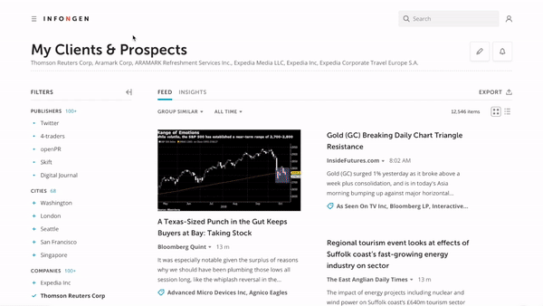
People are able to manage feed content by using different types of sorting like article relevancy, content clustering, and read articles from the specified periods of time. A smart search engine gives additional options and tips if there are no results for selected parameters or some error occurs. Special mapping for sentiment analysis helps to get the main point without reading all the information.
Dashboard helps customers work with the information and identify actionable insights that are crucial for them. Different charts and graphs give a full topic overview without diving into details. Therefore, the consumer can get deep analysis using its customization.
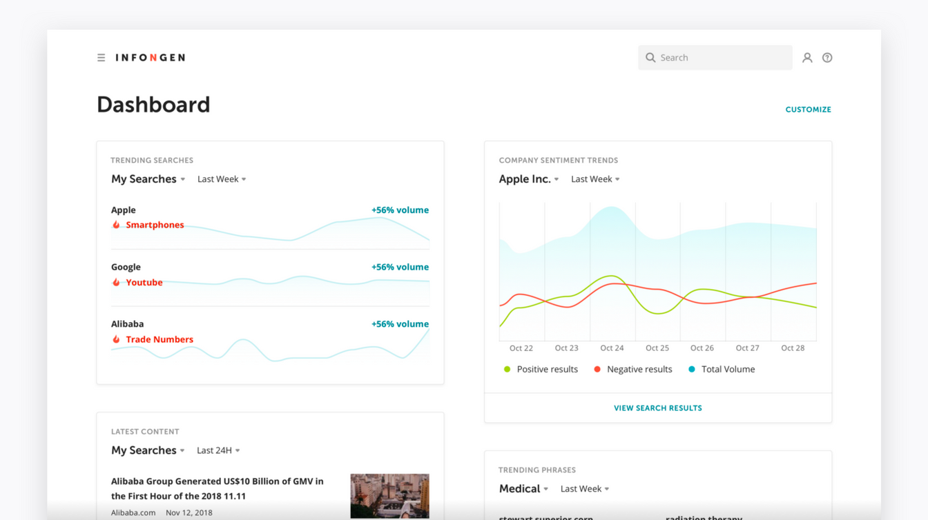
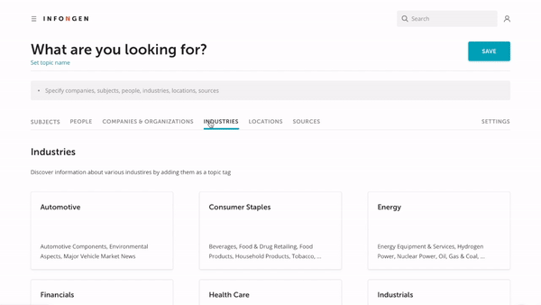
We re-organized the tag library for faster and easier search of needed keywords. Now it looks more similar to the usual catalog with straightforward navigation and clear structure overall.
Clean, light and modern interface draws people’s focus to the information, that is relevant at a given moment. Vivid brand color accents help to move their attention to the things that require it. At the same time, the platform is white labeled, so it could be easily integrated into other different environments.
Verifying Solutions
Finally, as we have created design mockups for the most typical use cases, it was paramount to make sure that our solutions actually work for our audience. We have run a series of moderated tests:
Several existing customers have been asked to perform typical tasks in a prototype of the new, redesigned product. Our design team members have always been present during the sessions. It allowed us to ask elaborative questions and receive detailed, live feedback.
In addition, we have asked users to fill out two identical questionnaires about the old and the new product. It contained several questions about their experience working with both. This allowed us to get quantitative data reflecting the effectiveness of our design.

The results of our testing sessions were quite positive. Even though the product has changed dramatically, people were fast to get acquainted with the new interface and complete their goals. However, there was some of our assumption that failed — terminology. In spite of many of our respondents mentioning unknown terms, in the beginning, our new simplified terminology has confused them even more. So we’ve rolled back to the previous one.
We have observed significant improvements in ways our audience performs their tasks. And we also have received constructive and informative feedback that allowed us to make improvements before the public release of the product.
Hand-Off (ex Implementation)
As we were working in a rapid release cycle environment even before we finished with all designs engineers already have started with development. To make transferring mockups in the most convenient way we used Inspect by InVision preliminary introduced it to the dev team.
Basically, we put our Design System as a separate prototype with notes and descriptions. There was a change log page so it became easy to follow and track every change for everyone.
Outcome
Lessons learned and other stuff
Final prototype in InVision